Thursday, May 29, 2008

Cartoon Skin VS Lumpypants

Eddie is fascinated by wrinkles, by real ones and he tells me theories about them all the time. This got me to thinking about how wrinkles are treated in cartoons.

CARTOONSKIN


Real wrinkles are really different than cartoon wrinkles.
Ever wonder why clothes fit so tight on old cartoon characters? Why the wrinkles don't look anything like real wrinkles?


Well it's for a logical practical purpose. It's much easier to move solid non-ambiguous forms through space to create smooth animation. Realistic wrinkles are way too elaborate and complicated to be able to control while animating. They are hard enough to draw as single images, let alone move. Anytime anyone tries it, the characters just seem to melt all over the screen. They have no form.
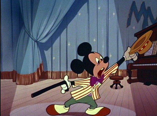
That's why wrinkles are kept to a minimum in old cartoons, and why they are generally very tightly wrapped around the forms of the characters. It makes an interesting surface look. It's called "cartoon skin".
The wrinkle physics of cartoon skin are applied to all surfaces of classic cartoons: flesh, fur, clothing.
[max_hare.jpg]

Even Rod Scribner who loves wrinkles and draws lots of them, still doesn't draw them remotely realistic. He just does looser floppier cartoon skin and creates a very funny effect.


ENTER THE AGE OF LUMPYPANTS


When I got started in the business they had abandoned cartoonskin in favor of a new form of equally unrealistic fabric surface - "Lumpypants".

This design approach is meant to be more sophisticated and serious than classic cartoon surfaces but it is doubly ironic:

1) It doesn't remotely look anything like the way wrinkles really look.
2) It's impossible to animate and makes the characters morph and melt all over the screen.

So in effect, it's both ugly and impractical at the same time, which seems to be the 2 general goals of animation ever since the late 60s.

Ugly and impractical equals "quality" in the minds of people who don't like cartoons, because it is so obviously not cartoony or fun.

Classic Disney used cartoonskin.

Disney - when it really was a "quality" animation studio used cartoonskin, even in its more elaborate high-minded features.
It was depressing drawing designless formless blobs in Saturday Morning cartoons in the 80s, but it was even more shocking to lovers of classic cartoons when "Disney" in the late 80s brought Saturday Morning cartoon design and Lumpypants to bigscreen big-budget fully animated productions.

LUMPYPANTS hit the big screen

There was a time when there was an obvious difference between quality cartoons and Saturday morning cartoons. You could tell instantly by the look of the designs what was a quality cartoon. Once Disney changed over to the Saturday Morning look it changed forever the automatic distinction between good and amateurish and gave tasteless executives even more control over big budget animation.

In effect we have DIC design fully animated.

Along with lumpypants came Saturday Morning cartoon storylines, too much exposition and explanation, bland music, Saturday Morning Cartoon colors and just general Saturday Morning Cartoon thinking all around - except with humongous budgets that somehow are supposed to magically turn all the bad creative decisions into quality.


The transition: Little Mermaid has a body and fish ass made of cartoon skin, but her hair is made of Ghostbuster Lumpypants.
The image “http://www.imyspacegraphics.com/images/the-little-mermaid/IMG0003.jpg” cannot be displayed, because it contains errors.


More on wrinkles in another thrilling article coming soon - comic book wrinkle theory

character Paintings

I like the brush technique in these top 2 paintings. They are very clean and crisp and each brush stroke has style. The colors are not too stimulating though, just basic primaries and secondaries.

The colors in the Flintstones ones are positively garish, even though the brush technique is good.

These colors are more subtle, although probably a bit dulled from the scans.


All these paintings are expertly done and very cartoony and fun.

Wednesday, May 28, 2008

Happytime With Uncle Mike's Toy Closet


Here's something a little more mature for you to think about than those superhero comics you grownups are reading.


By the way, these are all great to draw from.
This group shot will help you with cartoony forms in perspective.


If you put this costume on while mowing the lawn, you will mature fast, I promise.

Monday, May 26, 2008

I Need A Damn Flash Programmer

I had a couple guys say they were interested in making me some add-ons to make Flash more animator-friendly, but they have since vanished into the ether.

I want to develop some new tools to use on George Liquor and show off to other animators.
There's money in it.

McCain, Barack color keys


Saturday, May 24, 2008

Pizza Doodletime - The Phantom

Eddie and I got to talking about why Mike hated superheroes, and I said it was a great American tradition that should be ever preserved, but in its more innocent purer state.

Then we tried to figure out who invented the first superhero and we guessed it was Lee Falk, creator of the Phantom.

I remember reading The phantom in the funny papers in the 60s and knew it had been around forever. I don't think he actually had any superpowers, but he had the more important thing that defines superheroes: he went around in public in his underwear. I don't know how that was ever invented, or whether it evolved out of something else. I would like to think that it just occurred to Falk or somebody as an inspiration. Imagine thinking to yourself: "I've got it! I will create a crime fighter who goes around in his underwear beating people up! And no one will question it!"

Then I tried to remember what he looked like. He had a pretty bland costume I recalled. But Eddie, who's more conscious of silky man-fashions than me reminded me that he had purple striped briefs as an accent over his leotards.
Eddie and I spent some time debating which side of your hand the thumb went on.
The first Superheroes were pretty sedentary. The artists hadn't discovered action poses yet.
It took Jack Kirby to invent the idea of drawing fighters in action poses.
Eddie said he remembered the Phantom couldn't fly, so he rode a horse instead. And the poor criminals only had mere cars and bullets.

Then I took to doodling some more superhero types.


We wondered whatever happened to the Cheerios Kid? I imagine he grew up and still gets his go powers from dried stale starch rings.
What's great about superheroes is that they are as preposterous as talking funny animals but are meant to be taken seriously. As if there were dramatic stories starring the 3 Stooges. Even stranger is that I've met people who take comic book writers seriously and I've witnessed people arguing over whose stories make more dramatic sense.

I wonder if Falk was outraged when Siegel and Shuster came along and gave a man in underwear magical powers, destroying the believability of a crime fighting man in underpants on a horse. Can he have imagined that one day there would be hordes of undergarment crime fighting heroes and the whole world would totally accept the concept as normal?

It must be a great job though to get up every day and think up new adventures for underpants. I'd like to do that in my retirement and see if I can get a horde of fans to take me seriously.

Superheroes are a great American tradition and I kind of wish they would go back to being more mainstream in cheap throwaway comics on newsprint so every little kid could grow up normal, instead of just a few super nerdy kids (and adults!) who have to go out of their way to specialty comic stores for blurry photoshopped angry superheroes with pointy anatomy on expensive slick paper.

Bring back Mort Weisinger!

Friday, May 23, 2008

More BG Layout Notes - HIERARCHY of Form and Composition


BG Layout artists, or the persons who will help me design the main scenes and setups will have to be able to draw a variety of types of forms, and use some basic principles of design and composition to make the scenes compose well with the characters.

The BGs should provide an instantly readable organic environment for characters to play out their stories.

Hopefully some of these qualities below will help you see what I am aiming for:

TREES - Build Trees out of overall forms, don't start with the details.


Each of these trees has an interesting overall form. Even the foliage is contained in a form; it's not a mess of random leaves.


When you go outside, squint your eyes when looking at trees. Try to see the form of the tree, rather than getting lost and confused in the details of leaves, bark and branches.


Each kind of tree has its own unique plan, and each member of each kind of tree has its own unique variation on the same overall plan.


Buildings/Cars- Man Made Organic Geometry
Man-made objects, such as houses and machines are made of simpler more geometric forms than nature's forms, but to be well-designed, they still have to have appealing, solid forms.

And, they also have to have variety in the shapes, details, textures, arrangement of forms.

Lots of negative shapes!

Composition. The biggest forms in the picture have to make the overall statement instantly. A viewer shouldn't be distracted by a lot of cluttered details and an absence of negative shapes.

What details there are should be much smaller than the bigger forms they help describe. They wrap around the bigger shapes- going in the same directions. Not in a strictly 100% mathematical way. there should be very slight organic imperfections, but not so much that they destroy the forms they are part of.


The bricks, windows etc. on the walls below are not drawn with a ruler; there are no 100% parallel lines. Edges have slight curves. Not all the shapes mirror each other.

The details are not evenly spaced apart.

The background is composed to make the character read easily in his environment.

This is the kind of thoughtful control I would like in the layouts of my cartoons. No haphazard wonky flat modern look.

Stylish but planned.

A car is more organic than a house, but still has an overall form, and again: the details wrap around the form. They don't go off in their own directions.
The door follows the form of the side of the car, the lines on the seats follow the shape of the seats, etc.
Nature - Organic Forms, but still forms
Good BG design makes the largest forms in the picture make a statement: a controlled purposeful instantly readable composition.

The details are less important.
The details follow the same perspective and physics as the larger forms.

Not all areas of detail are filled equally. There are sparse areas or completely empty areas.

THE DETAILS ARE MUCH SMALLER THAN THE LARGER FORMS

This is so important. If the details get too large, or stick out of the silhouettes of the larger forms, they make it harder to see an overall form.
This Frazetta drawing looks elaborate and detailed, but follows the same ideas and planning of the more cartoony art above. All the little details - the bark texture, the moss, the flowers and mushrooms are much smaller than the twisted solid tree root. The tree root is the important graphic statement.

If the details were too large, or didn't flow around the root, or stuck out of the silhouette of the root more, you wouldn't feel or see the root so clearly.

There are sparser areas of detail on the root-between the areas of moss, for example.

I don't need anything this detailed in my cartoons, but the principles are what I am after.

The big picture should be solid, interesting and instantly readable as what it is - and not get in the way of the characters..

HARVEY EISENBERG APPLIES ALL THESE IDEASHIERARCHY OF FORMS AND COMPOSITION
APPEALING SHAPES
NEGATIVE AREAS
DETAILS FOLLOW FORMS

A VARIETY OF FORMS AND TEXTURES

ALL COMPLETELY CONTROLLED TO MAKE AN EASY TO READ FUN PICTURE

SO DOES MEL CRAWFORD
STYLE WITH CONTROL