Wednesday, November 29, 2006

BG painting 3 Art Lozzi- scooter looter-paint technique-

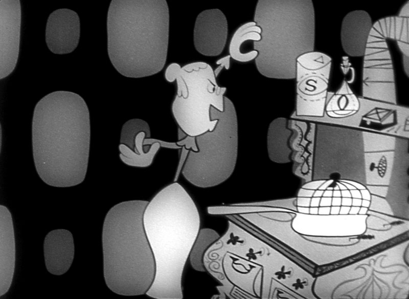
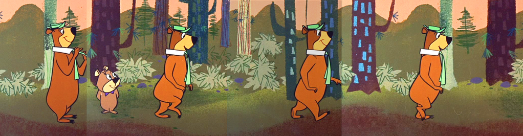
How about a cartoon with layouts by Ed Benedict, animation by Carlo Vinci and BG paintings by Art Lozzi? Add it up and get cartoon ice cream.

I want to start talking a bit about painting technique. Technique is different than color.

So far I've talked only about color theory and nothing at all about brush technique. They are two completely separate things. You could be good at color but not so good at technique. There are a lot more artists who are good at technique but are not as good at color. I don't know why exactly. I guess you can learn technique but not taste.

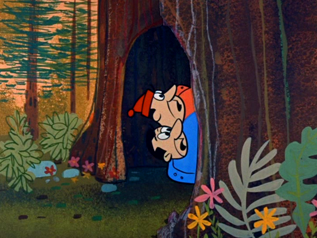
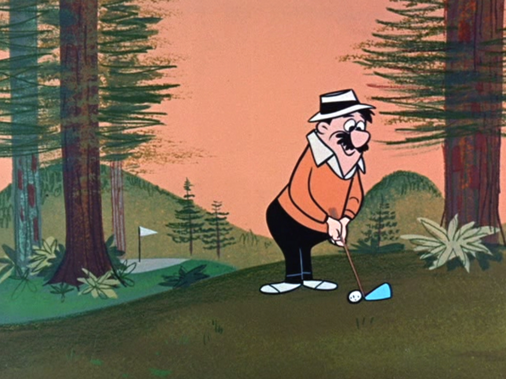
Art Lozzi was excellent at both. Look at this beautiful painting below.

The color thinking on this tree BG above is very similar to the color thinking in this Frazetta painting below, yet the two styles look completely different. Why?
Because the painting techniques are different.
Here's a painting by Kristy Gordon. Similar thinking in color. Another different painting technique.

The general technique that Lozzi and Monte and the early Hanna Barbera painters used was painting with sponges and friskets.
This one above is by Monte.
Below is Art. Simlar techniques but different styles.
They would cut holes in cells (friskets) in the shapes of certain objects, like the trees above, and then dip a sponge in paint and apply the sponge over the frisket.

Then when they peeled the cel off the paper, there would be a textured tree in the shape of the frisket on top of the BG color.

Sometimes they would keep layering sponge textures on top of the paint and even use smaller friskets to fill shadow shapes in with.
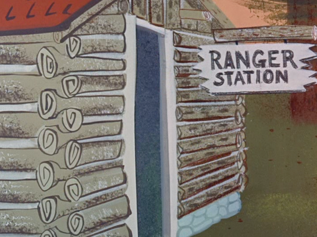
Below you can see contrasts in techniques. There is some flat color (the sky), some sponge (the tree on the right) and some dry brush (the trees on the left).
If the painting was completely filled in with equal amounts of texture from left to right, the BG would be indistinct and hard to read. Contrasts are important in all aspects of creativity. Contrasts are punctuation. They are what tells you what to pay attention to. Stories need contrast, dialogue needs contrast, acting needs contrast, composition needs contrast, design does, animation does, timing does-everything does.


Here is a similar technique with less contrast from Disney. See how more monotonous it is compared to the better designed, better colored and contrasty styled HB BGs? Looks like wallpaper.


Without contrast or punctuation you have monotony. Controlling contrasts is very difficult and I'd say even impossible for weaker artists or actors or writers. Today's prime time cartoons are extremely monotonous because they have no punctuation or contrasts in any of the creative aspects of them. Everything just drones along at the same pace, volume and evenly spaced design. Nothing is more important than anything else. It all just lays there and expects you to weed through the morass to find what the entertaining parts are.
This BG above has all the paint techniques I've been talking about plus some pencil shading on the grass and hills and trees. Lots of contrasting textures, values and negative shapes.

These HB painting techniques can be very simple...
..or more complex
Even the lines on the trees are full of contrasts. Some are close together. Some are far apart-they are not evenly spaced. Some lines are painted on, some are drawn with colored pencils, some lines are curved, some are jagged.Even though the striking styling of this is bold and cartoony, the control of the contrasts in techniques and design and color makes it all organic and natural.... as opposed to today's mechanical computerized looks.

God, those multi million dollar budgeted prime time cartoons don't even HAVE painted backgrounds. The flat characters vanish right into the flat fluorescent backgrounds. These HB cartoons were originally budgeted at $3,000 each-or $9,000 per half hour and they are infinitely more complex and skilled than what you get for 3 million. Here's millions of dollars worth of artistic achievement.


I've asked Art if he would be willing to explain to us his step by step procedure in painting backgrounds like this. Tell him in the comments how much you would appreciate that!


Saturday, November 25, 2006

Say Hi To Steve Worth in the hospital

Steve is sick: Kali and Marlo show how much they care for his sweet ass.

Steve is a real hero in animation today. He's the guy behind the Asifa Animation Archive.
http://www.animationarchive.org/
He's building a huge library of great cartoons, comic art and illustration from the Golden Age Of cartoons and letting the public come in and look at all this cool stuff for free.


Well the poor guy is in the hospital. We saw him yesterday and he looks like he's getting better, but maybe a pile of you cartoon fans can let him know you love what he's doing and need him to come back fit and soon. Maybe you've got a cute sister for him.

Say hi on here and offer a hug or a bratwurst then go to his amazing site and say hi in his comments too!


If you hunt around his site you find some really great rare cartoon art and artists!

Here're some of my favorites, but there's tons more stuff:

http://www.animationarchive.org/2006/11/biography-carlo-vinci.html
http://www.animationarchive.org/2005/11/filmography-betty-boop-in-snow-white.html
http://www.animationarchive.org/2005/10/filmography-coal-black-and-de-sebben.html
http://www.animationarchive.org/2005/10/biography-natwick-on-iwerks.html
http://www.animationarchive.org/2006/03/media-mel-crawfords-golden-books.html

I was so excited when I took this picture, I couldn't stop shaking.
Send Steve some love! He is a giant in our field and we all need him!


And you could donate to the archive too and help Steve preserve our cartoon heritage!
https://www.paypal.com/cgi-bin/webscr

Or if you're in the LA area and want help with the archive, you can volunteer some time and see fantastic cartoons while you're at it!
http://www.animationarchive.org/2005/10/volunteer-call-helping-at-archive.html

Friday, November 24, 2006

Thanksgiving with Kali, Mike and Marlo

Well I finally managed to coax some cartoon chicks to come over to try my meat recipes.

These gals are the wackiest!

Marlo was the first to dare opening something.

Once my meat passed the taste test, I was allowed a seat.
But then Mike showed up and no one paid attention to me anymore.
The girls get Mike soused to loosen his morals.
Now he's ready and easy prey.
These hot blooded latin boys get all the action.Marlo gives a subtle hint of what she wants.

Eddie heard there were cartoon chicks on the make at my place, so he put on his best costume and paid a surprise visit.

Wednesday, November 22, 2006

Only Superhumans Qualify As Entertainers - Buster Keaton


Kali just turned me on to Buster Keaton films.I had seen Sherlock Jr. and Steamboat Bill way back during college days but was too into discovering lost cartoons to be paying enough attention to silent films.

Thanks, Kali for correcting my oversight.


Anyway, Keaton really illustrates a point I have been making on this blog-that only people who have amazing ability should be entertainers, not just average people who live next door to you, like we have today.

Nowadays we have cartoons by people who can't draw (or write), "voice actors" by people who don't have distinct voices or acting ability, "songs" where people talk instead of sing and tell you how great they are without having to prove it to you with skill and talent.

Imagine if the people who run entertainment today took over sports?

We'd have basketball teams with short fat bald white men, Ultimate Fighting would pit skinny little emo cartoonists against each other, people who can't swim would be water sports heroes having female fans screaming at their drowning contests.

While we're at it, let's also have chefs who have no sense of smell, 110 lb firemen, nearsighted arthritic surgeons, paraplegic dancers, presidents with low I.Q.s, people who can't animate writing books telling you how to judge animation and scientists who believe in Intelligent Design.

A few decades ago, people automatically assumed that when they went to witness professional entertainment, they would be watching superhuman talents doing superhuman feats - doing things that they never would have imagined themselves being capable of doing.

Not any more. Everybody alive can talk and they can write sentences. That qualifies you to be a writer and a rap star or a cartoon voice. You don't have to be able to do something that takes years and decades of practice and skill and super talent.

Is there anybody alive that couldn't write or draw Family Guy? Anyone looking at that or listening to a rap "song" can easily imagine himself with a couple weeks practice and some luck being able to be a big star.

Yeah, I know the blind deaf and dumb South Park fans are gonna get on here and argue, but that's my point. When you see a REAL entertainer, you can't argue that what he or she is doing is not amazing when it is so far above the level of average or even exceptional ability. You can argue all you want about today's crap because it is so vague and amateurish, it all comes down to the general level of gullibility of the entertainment-starved unwashed masses who have been raised on low expectations and will fight to the death over stuff they could do themselves.

Now no one could watch Bugs Bunny and say, "Oh I could do that." Or "The Honeymooners". Can anyone imagine regular people being that funny?

Now, watch Buster Keaton and see if for a second you can imagine yourself doing what he did to earn his fame and immortality.


Get Sherlock Jr. and be absolutely amazed at what a true genius can do without the aid of special effects or executive meddling.


And go to Kali's blog and thank her for being smart and having extraodinary taste in an age where there isn't much.

http://kalikazoo.blogspot.com/2006/11/buster-keaton-genius.html


She also pointed out to me that the only modern heir to Keaton is Jackie Chan who of course, once he came to Hollywood, the execs made him do much less of what made him famous and waste most of the time in his movies with bullshit "story" and "heart".

You should all be really mad, knowing that superhuman entertainment is actually possible, but corporate America won't let you have any.

I hope you are broadening your minds by seeing some of the feats of human prowess I introduce you to on this blog. There is a ton of it out there. You just have to dig back a few decades and then keep working your way back through history to find truly inspiring and exciting things to make you proud to be a part of a species that once was great.

By the way, a lot of gags that you associate with cartoons were invented by Buster Keaton and other silent comedians.

EZ-POP, little old lady in shoe, John Hubley

I was a design freak when I was a kid. I loved all cartoons, but really thought a lot about style and design-which I don't recommend that you do until you learn basic drawing principles!

These striking images are from a John Hubley commercial for EZ Pop Popcorn from the early 50s.
I'm not a big fan of UPA cartoons, mainly because they are not very entertaining and the animation is stiff and limited.

For some strange reason though the "UPA Style" worked best in 50s commercials.

This commercial is not only designed beautifully (much better than UPA's "entertainment" shorts) but it has great bouncy animation, a really lively track, cartoony characters and movement, brilliant cutting, fun timing and crazy background graphics.


By contrast, UPA's theatrical shorts are sluggish, bland and depressing and they have horribly influenced the whole cartoon art form-even today, 60 years later.


The artists that drew and animated this cartoon all learned classic basic cartoon principles.
You can tell by the drawings that they understand construction, line of action, squash and stretch, silhouettes, clear staging, negative space and all the principles I have been going on and on about in my blog posts.

FORMS WITHIN FORMS
This frame above starts with a clear and simple COMPOSITION. There is a ring of popcorn heads framing the product.
All the heads within the ring are SPECIFIC DESIGNS-each a variation of a general shape-the shape of a kernel of popcorn.
The overall composition uses NEGATIVE SPACE to make the POSITIVE Shape (the ring of heads) read clearly.
Each individual head uses negative spaces to make the positive features (eyes, mouths, noses) read clearly.
The negative spaces between each head are interesting shapes.
The CONSTRUCTION of the heads is slightly played with and distorted-and that's what makes the images look to today's primitive eyes- "stylized".

LOOK UP ALL THE CAPITALIZED CONCEPTS IN THE BLOGGER SEARCH AT THE TOP OF THE PAGE TO READ BLOG POSTS EXPLAINING THE CONCEPTS.


Every scene in the cartoon has an overall design. The individual pieces-characters and props are carefully fit into a larger design.

Today's UPA copycat cartoons look like each piece is individually designed, then the pieces are thrown onto the stage in a haphazard cluttered pile.


Obvious LINE OF ACTION.
CLEAR POSE.
NEGATIVE SHAPES
ORGANIC SHAPES
ASYMMETRICAL DESIGN AND POSE.
CARTOONY
Just like this:


THESE IMAGES ARE DESIGNS WITHIN DESIGNS.
The group of kids is a shape- squint your eyes and look at them as one form.
Then that form is broken up into individual kids and then each kid is broken into his separate forms-but no matter how deep you go into analyzing the details and forms in the frame, they all fit into larger design statements.

Now, beyond how great the design is, the way it MOVES is perfect for the style. The animator had to find an appropriate style of movement that didn't distract from all the compositions and designs in the still pictures.

In the UPA shorts, the designers seemed to worry that the animators would distract from the design, so they developed a style of non-animation. Gerald McBoing Boing is basically inbetweened from pose to pose and is pretty boring to watch.

This stuff moves in an extremely cartoony, bouncy and fun way and it totally enhances the design.


The commercial is so fun and cartoony and to the point that it totally sells the product. It makes you want to eat the popcorn.

It also makes me want to see an entertainment cartoon that's designy-but with solid PRINCIPLES, not superficial wonky flatness- a cartoon that does all the things a cartoon can do that no other medium can.

This EZ Pop cartoon couldn't be done in live action or even CG and that is the main reason to doo it in animation. To use the magic that only real animators can make.


Thanks to Amid Amidi for the crisp images at the top of the page and for uncovering so much lost animation art and films and making the best animation magazine ever-Animation Blast. It's the only animation magazine that is actually about animators.

He also is the outspoken uncensored half of Cartoon Brew.
Amid has a book out all about 50s designy cartoons. It's full of great art (and some pretty awful art too-look at the damn cover!).


Of course, as in all art books, much of the art is way too small and there is a ton of wasted white space, but you have to buy the book anyway. Take the opinions with a grain of salt-it praises the movement that ultimately destroyed cartoons.

I'm gonna do more posts about designy cartoons. The main point I will make is that just drawing flat and primitive like so many Cartoon Network shows and others today does not make a good design.DISCONNECTED SHAPES, NO SILLOS, NO NEGATIVE SPACES WITHIN DESIGNS
GENNDY IS THE BEST
I think Genndy is hugely talented, and that's why I recommended "Dexter's Lab" as a series to Fred Seibert and wrote about it in Animation Magazine. He makes the best of today's flat school of cartoons.

Genndy is great at timing, cinematic storytelling and really great at color design-the best today.

TO MAKE MY POINT CLEAR THOUGH ABOUT STYLIZED DESIGN, I HAVE TO SAY THAT THE DESIGN IN EVEN GENNDY'S WORK IS MISSING WHAT THE FANCY DESIGNERS HAD IN THE 50S-GOOD DRAWING PRINCIPLES.

Genndy himself told me in a published interview that he wished he had stronger drawing skills.

I think the character designs in his cartoons (the drawing "style") are very awkward and many times(as in the examples) not well composed and don't utilize the larger principles of drawing and design.

I can say the same thing about many many scenes in my owncartoons (and I have and will)-but I'm not relying so heavily on "design" for my entertainment value.

If you are going to shout "Hey look at how designy my cartoons are!", then you could benefit from stronger design and drawing principles. - Not just drawing eyes in a square and calling it a face.

CHARACTERS PASTED IN THE FRAME, NOT RELATING AS A COMPOSITION, NOT AFFECTING EACH OTHER
NO COMPOSITION, CHARACTERS NOT RELATING TO EACH OTHER, BROKEN UP POSES


CHARACTERS MADE OF DISCONNECTED PIECES OF BROKEN GLASS, GENERIC SHAPES AND EXPRESSION
YIKES!! UNBELIEVABLE

Good strong traditional drawing principles are the foundation of good design, so I consider all this flat craze to be horribly dangerous and an impediment to making quality cartoons. Drawing flat today is just an excuse to not do anything hard or have to learn all the tools that are available for animated entertainment.

Style CAN be good, but only in the hands of really great traditionally trained artists and it should never replace entertainment value. It should merely add an element to it.